
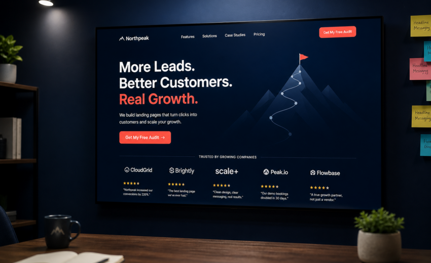
How to Build a High Converting Landing Page: A Practical Framework
A high converting landing page is mostly a subtraction problem. Most pages underperform not because they’re missing a persuasion technique, but because they’re carrying six things that shouldn’t be there: a site-wide navigation bar offering fourteen ways to leave, three competing calls to action, a form asking for a phone number nobody wants to give yet, and a hero image that takes four seconds to appear.
The framework below is what I use when building or fixing landing pages. It’s ordered by impact. If you only do the first three sections, you’ll capture most of the available gain.
One honest note up front: I’m not going to quote you conversion rate benchmarks. Published averages are gathered from wildly different traffic sources, offers, and price points, and applying them to your page is guessing with extra steps. Your baseline is your own current rate. Beat that.
The one rule: one page, one job
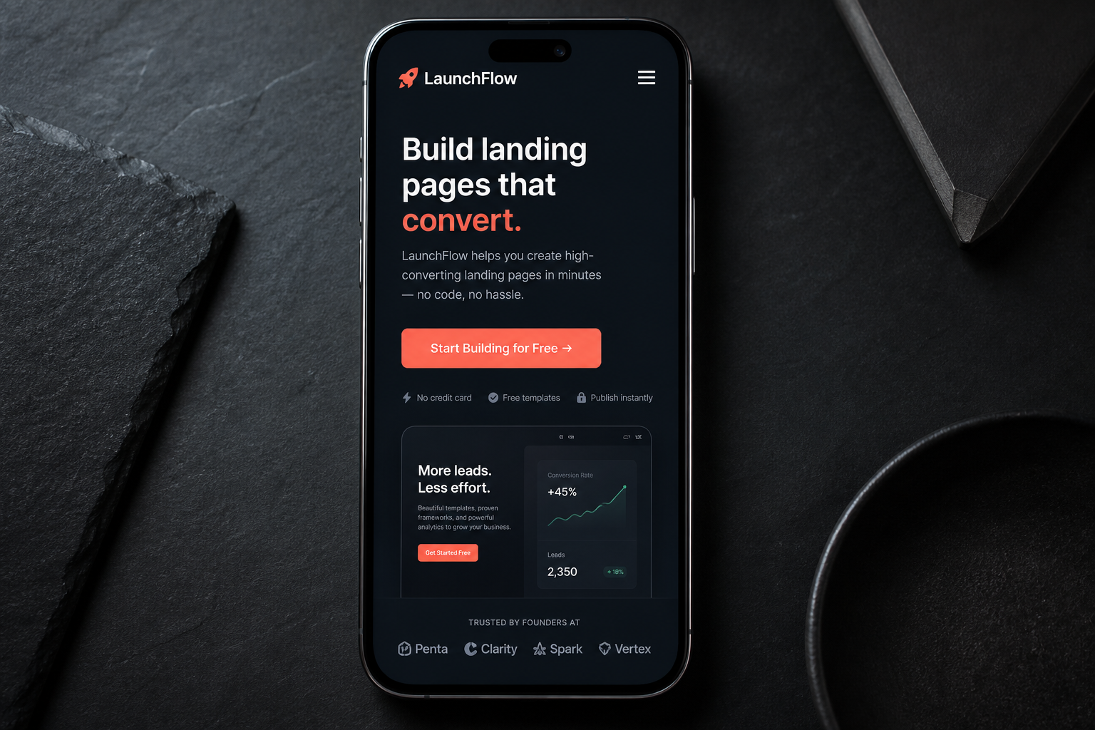
Before structure, before copy, before design — decide the single action this page exists to produce.
Not “generate leads and build brand awareness and rank for our category.” One action. Book a call. Start a trial. Request a quote. Download the thing. Buy the product.
Every element on the page then faces a simple test: does this move someone toward that action, or does it give them something else to do? Anything in the second category comes off. This is what separates a landing page from an ordinary web page — a homepage serves many intents, a landing page has exactly one.
The most common violation is site navigation. A full header menu on a paid-traffic landing page is an invitation to wander into your About page and leave. Strip it to a logo and, at most, a phone number.
The second most common violation is competing CTAs. “Book a demo” in the hero, “Download the guide” halfway down, “Subscribe to the newsletter” in the footer. Each one splits attention, and each softer option lets someone feel productive without doing the thing you need. Repeat the *same* CTA three or four times down the page. Don’t offer alternatives.
Message match: the highest-leverage fix
Message match is the alignment between what someone clicked and what they land on. It’s the biggest lever on most underperforming pages, and it’s usually free to fix.
If your ad says “Emergency plumber, 45-minute response, Dallas,” the page headline should say something extremely close to that. Not “Welcome to Smith Plumbing — Quality Service Since 1994.” The visitor spent about a second and a half deciding whether they’re in the right place. Make that decision trivially easy.
Apply it in three places:
- The headline. Echo the language of the ad, the search query, or the email subject line that produced the click.
- The visual. If the ad showed a product screenshot, show that screenshot. Continuity is reassurance.
- The offer. If the ad said “free audit,” the page had better lead with a free audit, not a contact form.
This is also why one landing page for six ad groups underperforms. Different queries carry different intent. “WordPress developer” and “fix slow WordPress site” are different problems and deserve different headlines, even if the underlying service is the same. Cloning a page and rewriting the top third is cheap; broad, vague pages are expensive in wasted ad spend.
For organic landing pages, the equivalent is matching search intent — informational queries want an answer before a pitch, commercial queries want specifics and pricing.
Page structure that works
A starting skeleton, not a law. It works because it follows the order people actually evaluate things: what is this, do I care, can I trust you, what does it cost me, what do I do.
1. Hero (above the fold)
- Headline stating the outcome in the visitor’s language. Specific beats clever. “Fix your slow WordPress site in two weeks” outperforms “Performance, Perfected.”
- Subhead with a one-sentence explanation of how, or who it’s for.
- Primary CTA button, visible without scrolling on a 360px-wide phone screen, not just on your 27-inch monitor.
- One trust element — a client logo row, a rating, a credential. Only if it’s true.
- A relevant visual. Product screenshot, actual work, real photo. Not stock photography of people laughing at a laptop.
2. The problem. Two or three sentences showing you understand the situation they’re in. This buys permission for everything that follows. Skip it and the page reads like a brochure.
3. The offer and what’s included. Concretely, what do they get. Bullets work here: deliverables, scope, format, timeframe. “Comprehensive solutions tailored to your needs” tells a reader nothing and costs you the sale to whoever wrote plainly.
4. Proof. Testimonials with a real name and company. Case studies with before-and-after specifics. Client logos. Screenshots of results. Use only what you genuinely have. An invented testimonial is a legal risk and, in my experience, easy for buyers to smell. If you’re early and have no proof, be direct about it and substitute something that reduces risk instead: a detailed process description, a money-back term, a small paid pilot, a free audit that demonstrates competence before anyone commits.
5. How it works. Three to five steps, to reduce uncertainty about what happens after they click. “What happens next” anxiety kills more conversions than price does.
6. Pricing or price framing. If you can publish prices, do. It filters out bad fits before they consume your time and builds trust with everyone else. If scope genuinely varies too much, publish ranges and say what drives them. “Most projects land between $2,000 and $8,000, depending on page count and content migration” is far better than silence.
7. Objection handling / FAQ. Write down the five things prospects actually ask on calls and answer them plainly. This is the most under-used section on most landing pages. Every unanswered objection is a reason to close the tab.
8. Final CTA. Restate the offer, restate the action, remove all friction. Same CTA as the hero, same wording.
Write CTAs that describe the outcome
Button copy is small work with real leverage. Two rules.
Describe what happens, from the visitor’s side. “Get my free audit” beats “Submit.” “Book a 15-minute call” beats “Contact us.” The win is specificity over generic verbs.
Reduce perceived commitment. “Book a call” sounds like a sales meeting. “Book a free 15-minute call” sounds like fifteen minutes. Time-bounding and price-bounding a CTA lowers the felt cost of clicking.
Supporting microcopy under the button does real work too: “No obligation. I’ll tell you if I’m not the right fit.” That sentence answers the fear that clicking starts a pressure sequence.
Put the primary CTA in the hero, then repeat it after the proof section and at the end. On long mobile pages, a sticky bottom bar is usually worth testing.
Form design: ask for less
The form is where intent goes to die. Every field is a small tax, and people abandon quietly.
Ask only for what you need to take the next step. For a discovery call: name, email, and maybe one context field. Company size, budget range, job title, and “how did you hear about us” are things you can ask on the call, once they’ve already invested attention. If you need something unusual, justify it inline: “So I can text you the meeting link.” Unexplained fields feel like data harvesting.
Practical details that matter more than they should:
- Labels above fields, always visible. Placeholder-only labels disappear the moment someone types and are an accessibility problem.
- Correct input types:
type="email",type="tel",inputmode="numeric". This changes the mobile keyboard and removes a small annoyance from every submission. - Validate inline, on blur, not only on submit. Reporting four errors after the button press is the worst possible timing.
- Never clear the form on a validation error. This still happens and it’s infuriating.
- Make the submit button state obvious while processing, and block double-submit.
- Use spam protection that doesn’t punish humans. A honeypot field plus server-side validation stops most bots. Reserve visible challenges for pages genuinely under attack.
- Design the success state deliberately. “Thanks, I’ll reply within one business day. Here’s what happens next” beats a page reload with a green bar.
Multi-step forms help when you genuinely need many fields — the first step feels small and completion bias carries people forward. They hurt when they add ceremony to what could have been three fields on one screen. Use them for quotes and configurators, not for “contact us.”
Speed is a conversion feature
A landing page that takes five seconds to become useful has already lost a share of its traffic, and paid traffic is the most expensive kind to lose.
Aim at Core Web Vitals thresholds, measured on real visits at the 75th percentile:
| Metric | What it measures | Good |
|---|---|---|
| LCP — Largest Contentful Paint | When the main content renders | ≤ 2.5s |
| INP — Interaction to Next Paint | Responsiveness to taps and clicks | ≤ 200ms |
| CLS — Cumulative Layout Shift | How much the layout jumps while loading | ≤ 0.1 |
What most often costs landing pages their speed:
- The hero image. Usually the LCP element and usually oversized. Serve it at display size, in AVIF or WebP, with explicit width and height, and don’t lazy-load it — lazy-loading your LCP image delays the thing you’re being measured on.
- Web fonts. Two families and six weights is 200KB and a render delay. Use
font-display: swap, preload the one font above the fold, and subset it. Or use a system font stack and spend the budget elsewhere. - Third-party scripts. Chat widgets, heatmaps, session recorders, four pixels. Each competes for the main thread and hurts INP. A chat widget that adds 600ms to interactivity has to earn its place.
- Page builder overhead. On WordPress, a builder often ships hundreds of kilobytes of CSS and JavaScript for a page using a fraction of it. This is why performance-sensitive pages sometimes justify hand-built templates or Next.js development.
- Layout shift. Reserve space for images, embeds, and anything injected after load. A cookie banner that pushes content down as someone reaches for a button is both a CLS failure and a genuinely bad experience.
If your existing pages are slow and you’re not sure why, WordPress speed optimization is the diagnostic-first version of this work.
Test what matters, and be honest about the math
A/B testing is useful and routinely misused. To detect a realistic improvement — say 3% to 4% — you typically need thousands of visitors and hundreds of conversions per variant. Most small-business landing pages don’t get that in a reasonable timeframe, which means most declared “winners” are noise.
Below that volume, do the higher-leverage thing instead: remove the navigation, match the message, cut the form fields, speed the page up, add real proof. Those are known improvements, not coin flips. If you do have the traffic, test big swings — a different offer, a different headline promise, a materially different structure. Button color tests are how teams spend three months learning nothing.
And measure the right outcome. A page can lift form submissions 30% by making the form trivially easy while reducing qualified leads, because you removed the friction that was filtering. Track to closed business where you can, not just to form fills.
The quick audit
Run your page against this. Each “no” is a fix.
- The page has exactly one goal and one CTA, repeated
- Site navigation is removed or stripped to a logo
- The headline matches the ad, query, or email that produced the click
- The primary CTA is visible without scrolling on a 360px phone screen
- The offer is concrete: what you get, in what form, in what timeframe
- Proof is present, specific, and real
- Price or price range is stated, or the reason it isn’t is explained
- The form asks for the minimum viable number of fields
- Inline validation works and nothing clears on error
- LCP under 2.5s and CLS under 0.1 on mobile
- Third-party scripts audited; anything non-essential removed
- The top five sales objections are answered on the page
- The success state tells them what happens next and when
- Analytics tracks the conversion event, and you can tie it to source
FAQs
What’s a good landing page conversion rate? Whatever beats your current one. Published benchmarks mix branded search, cold paid traffic, and warm email lists across offers ranging from a free PDF to a $50,000 contract — they don’t transfer. Measure your own baseline, change one substantial thing, and compare.
Should a landing page have navigation? Not for paid or campaign traffic. Every nav link is an exit. Strip it to a logo and possibly a phone number. Organic landing pages that need to sit inside your site architecture are a different case — there, some navigation helps users and helps internal linking, and the tradeoff is usually worth it.
How long should a landing page be? As long as it takes to answer the questions someone has before acting, and no longer. A $30 product needs a short page. A $15,000 service needs proof, process, pricing, and objection handling, and that runs long. Length isn’t the variable — unanswered questions are.
Do I need a separate landing page for each ad group? Usually yes, if the queries carry different intent. Message match is one of the strongest levers available, and cloning a page to rewrite the headline and top section is cheap relative to the ad spend you’re wasting on a generic page. Group by intent, not by keyword count.
Should landing pages be built in a page builder or custom? Page builders are fine when iteration speed matters more than page weight and marketing needs to ship without a developer. Custom templates win when the page is performance-critical, carries significant ad spend, or needs precise design and interaction. Many businesses reasonably do both.
Where do most landing pages fail? In rough order of frequency: message mismatch with the traffic source, too many competing actions, a vague offer, no real proof, and a form asking for far more than the next step requires. Speed is a close sixth and often the cheapest to fix.
Want a second pair of eyes on your page?
Send me the URL, the traffic source, and what the page is supposed to make happen. I’ll tell you what I’d change first and whether it’s worth doing. If the page is fine and the problem is upstream in your targeting or offer, I’ll say that instead.
A single page typically runs $400–$1,500 — scope and process are on the landing page development services page. If the problem is broader than one page, a website redesign is the more honest answer.
August 14, 2026
WordPress Core Web Vitals: What Each Metric Means...
August 14, 2026