
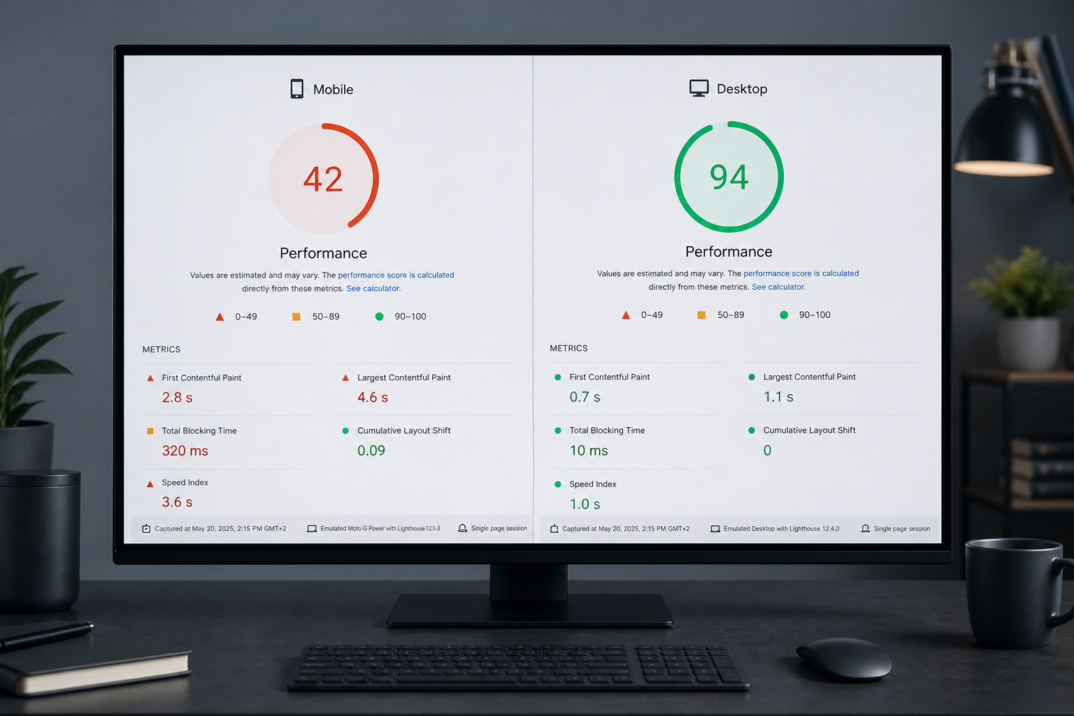
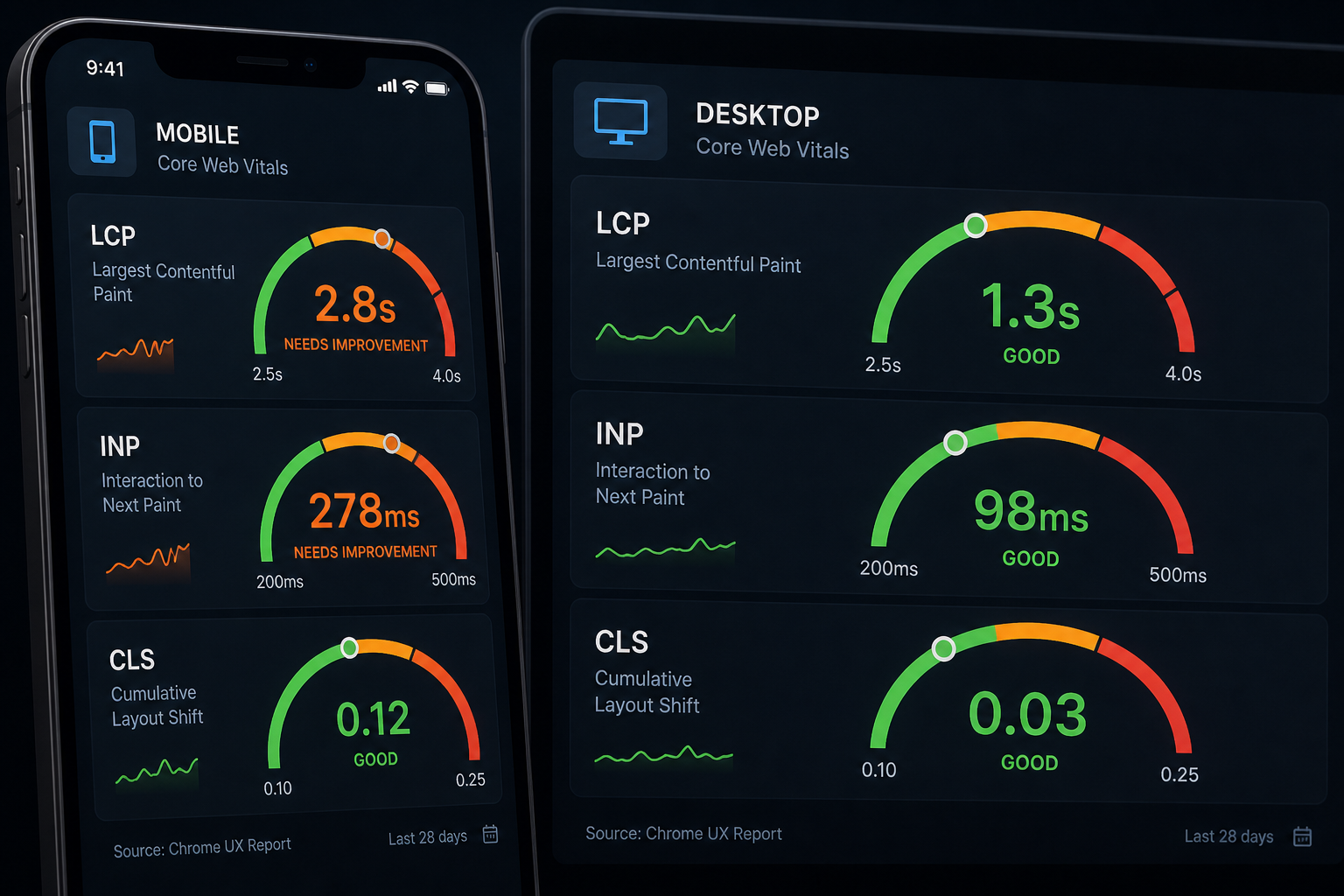
When your mobile PageSpeed score is lower than desktop — often by 20–40 points — the gap usually comes from JavaScript execution on slower mobile CPUs, heavier image delivery to mobile viewports, and Lighthouse's mobile network throttling. Desktop lab tests run with faster CPU and less aggressive throttling, so they hide problems that real mobile visitors hit daily.
This matters because Google assesses Core Web Vitals separately for mobile and desktop in Search Console. A site that passes desktop LCP while failing mobile LCP still has a mobile page experience problem — and mobile traffic is typically the majority.
Why mobile scores lower: the technical reasons
| Factor | Mobile impact | Desktop impact |
|---|---|---|
| CPU throttling in Lighthouse | 4× slowdown simulated | No slowdown |
| Network throttling | Slow 4G profile | Broadband profile |
| Same JS payload | Slower parse/execute | Absorbed by faster CPU |
| Same image files if srcset wrong | Downloads oversized assets | Displays larger viewport — sometimes appropriate |
| Touch interaction INP | Measured on slower hardware | Often not tested the same way |
| Viewport-specific layout | More reflow on narrow screens | Wider layout stable earlier |
The gap is expected to some degree. A 5-point difference is noise. A 30-point difference signals fixable mobile-specific issues.
Step 1: Compare PSI reports side by side
Run pagespeed.web.dev on the same URL. Switch Mobile and Desktop tabs.
Record for each:
| Metric | Mobile | Desktop |
|---|---|---|
| Performance score | ||
| LCP | ||
| INP (or TBT lab proxy) | ||
| CLS | ||
| TTFB | ||
| LCP element |
If mobile LCP element differs from desktop, you may need separate fixes per template breakpoint.
Step 2: Diagnose mobile LCP gap
Common mobile LCP failures when desktop passes:
| Cause | How to confirm | Fix |
|---|---|---|
| Mobile served desktop-sized hero image | DevTools mobile emulation → Network | Fix `sizes` attribute on srcset |
| Hero hidden on mobile, different LCP element | Compare LCP element in PSI | Optimize mobile LCP element specifically |
| Mobile-specific CSS blocking render | Coverage tab on mobile viewport | Reduce mobile-critical CSS |
| Higher TTFB on mobile CDN path | WebPageTest mobile location | CDN/mobile cache config |
| Lazy-loaded mobile hero | View source at mobile UA | Remove lazy from mobile above-fold image |
Guide: fix Largest Contentful Paint.
Step 3: Diagnose mobile INP gap
Mobile INP fails while desktop passes in lab — very common on WordPress.
| Cause | Fix |
|---|---|
| Same 800KB JS on all devices | Reduce JS; delay third-party scripts |
| Page builder frontend scripts | Per-page loading; simplify mobile nav |
| Chat widget on every page | Delay or restrict to desktop/contact |
| WooCommerce cart fragments | Reduce polling; disable on non-shop pages |
Guide: fix Interaction to Next Paint.
Step 4: Diagnose mobile CLS gap
| Cause | Fix |
|---|---|
| Mobile cookie banner pushes content | Overlay instead of push |
| Different font sizes cause reflow | font-display; preload mobile weights |
| Mobile ad units different size | Reserve min-height per breakpoint |
| Sticky mobile header height change | Fixed header height |
Guide: fix Cumulative Layout Shift.
Step 5: Image delivery for mobile
The `sizes` attribute tells the browser which srcset image to download.
Bad example — browser may download too large a file on mobile:
“`html
<img srcset="400w.jpg 400w, 800w.jpg 800w, 1600w.jpg 1600w"
sizes="100vw" … />
“`
Better — matches layout breakpoints:
“`html
<img srcset="400w.jpg 400w, 800w.jpg 800w, 1600w.jpg 1600w"
sizes="(max-width: 768px) 100vw, 800px" … />
“`
WordPress should generate srcset automatically. Page builders and ACF image fields often break `sizes` — check custom templates.
Step 6: Test on real devices
Lab simulation misses real-world variance.
| Test | Device suggestion |
|---|---|
| Mid-range Android phone | Represents CrUX majority better than flagship iPhone |
| Slow 4G throttling in DevTools | Baseline before real device |
| Search Console mobile field data | Ground truth for mobile vitals |
A site that scores 90 mobile in Lighthouse on your Mac may still fail mobile CrUX — trust field data.
Closing the gap: priority order
- Confirm mobile field data failure (Search Console → Mobile)
- Fix mobile LCP element and image sizes
- Reduce/delay JS hurting mobile INP
- Fix mobile CLS sources (banner, fonts, ads)
- Verify TTFB from mobile test locations
Don't optimize desktop further while mobile field data is Poor. Desktop polish has diminishing returns.
When the gap is structural
Some page builders load identical asset bundles on all breakpoints. Mobile-specific performance requires either:
- Per-page/per-device asset loading plugins
- Simpler mobile templates
- Theme or rebuild with performance budget
If mobile gap persists after standard fixes, a website performance audit identifies whether the theme is the ceiling.
Frequently asked questions
Is a 20-point mobile/desktop gap normal?
A small gap is normal due to throttling. Large gaps (25+) usually indicate mobile-specific JS or image issues worth fixing.
Does Google use mobile-first indexing for speed?
Google indexes mobile version. Mobile Core Web Vitals matter for page experience assessment on mobile search results.
Should I optimize for mobile lab score or mobile field data?
Field data. Lab mobile score is a diagnostic; CrUX is the score that reflects real visitors.
Can AMP fix the mobile gap?
AMP can produce fast mobile AMP URLs but adds maintenance. Fixing the canonical mobile experience is the durable approach.
Does responsive design automatically fix mobile speed?
Responsive layout ≠ mobile performance. Same heavy JS on a narrower screen is still heavy JS.
Book a free 15-minute site audit
Desktop green, mobile red? Book a free 15-minute audit. I'll compare your PSI mobile vs desktop reports and identify whether images, scripts, or server response drives the gap — or scope a website performance audit for full template review.
August 5, 2026
LCP Audit: How to Fix Largest Contentful Paint
August 5, 2026